Wednesday, August 25, 2010

A card in blue


Hi all you stampers in cyberland. It is Wednesday and it was beautiful today here in Michigan.
I had to work though, so I didn't get to see too much of it.
I needed a sympathy card, so I tried to keep it simple yet attractive. I also love this verse and I wanted to use it here. This verse reminds me that God takes care of my every need and never forgets that I AM HIS!!!
That's what I want to convey to the  family I am sending this to. God holds them in His loving arms and cares about their pain.

The background is Cuttlebug Dotted Swiss. The two  panels are stamped with a wheat stamp in silver ink. Then overstamped with an iris stamp in medium blue. To get that light look, I stamped off on scrap paper, then stamped the panels.  I didn't want the stamping to stand out too much and it shows off a bit more in real life. It's pretty light here in the picture. The silver ink  took on almost a gold look, but when you move the card around, it is definitely silver.

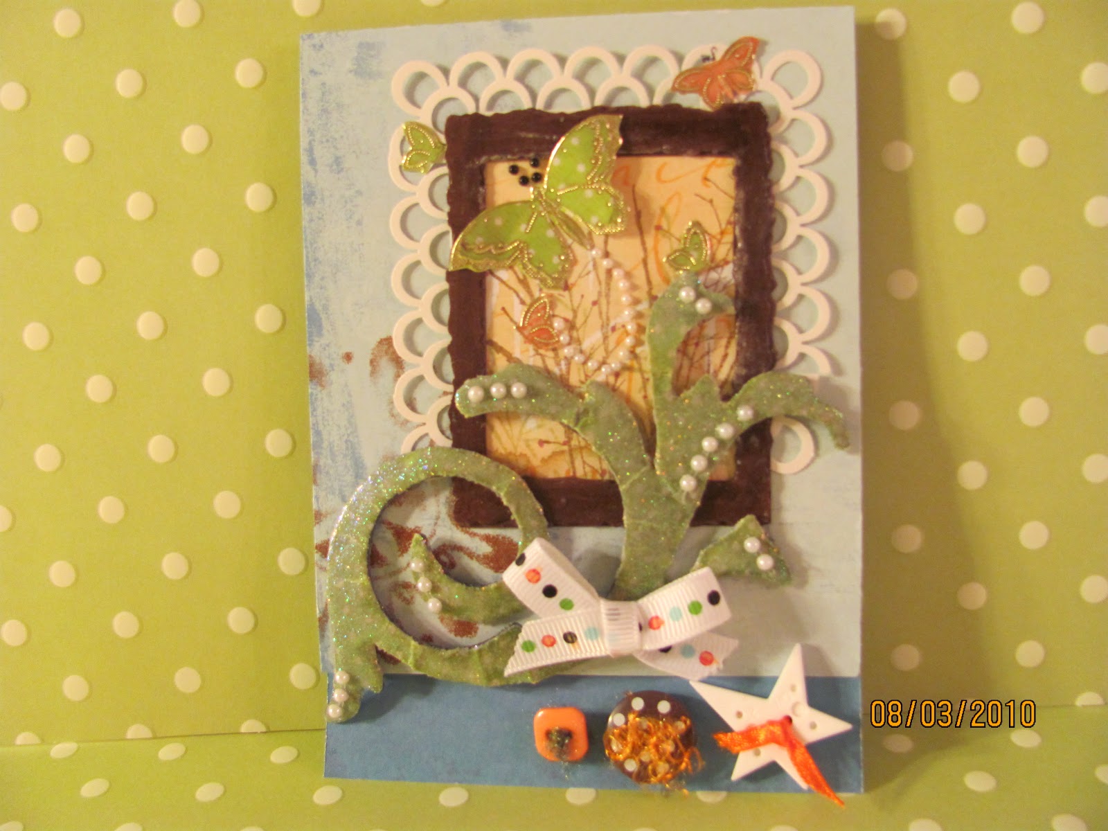
The double circle bottom cut is a Martha Stewart edge punch.
The small butterflies are also Martha Stewart. Bottom layer is the blue of the mats and the top is cut out of scraps from the stamped panels.
Some very small gold bling added too. I can't do a card without some glitz!!!

Challenges entered for this card:

ttfn: e

Saturday, August 21, 2010

I can't believe it's been two weeks!!!!!!!

I am SO SORRY!!!! We've been working on re-doing our bedroom and time just totally got away from me. I am kind of an "in the moment person" and I get totally involved in what I am working on. And right now, decorating the walls in our newly painted bedroom is just fun! fun! fun! I LOVE IT!!! I went shopping today with a friend for all the little decorating stuff that is so fun to buy and I was amazed at how much scrapbooking has become part of the whole decorating scene. There are flourishes, cute phrases, art for walls, words for walls, etc. etc. etc. Everything I looked at, all I could say was "I can DO that!!!!" Of course, the thing is, it would take forever to do it all yourself.


I have a card  that I want to share with you. The background stamp is "Amazing Grace". I just love it!!! I found it at a scrapbooking show in Novi, Michigan (near Detroit). I went there with a friend. Didn't have a whole lot of money to spend so I was being very careful with my purchases. But, when I saw this stamp, I just had to have it. I'm sure I will use it a lot!!!

I made this for Gina K Tuesday Sketch Challenge. I had already started this card because I love inchies and the next day her challenge came up and it was EXACTLY what I was making!!!  How often does that happen????

Card details: First I stamped the Amazing Grace stamp on white, lightly glittered, shiny, heavy cardstock I had bought for Christmas. I stamped in Versamark and embossed in white.
Then I used Distressed inkpads of spiced marmalade, worn lipstick and fired brick. Just kept working it until I liked it. I also used black to get dark spots so it looked splotchy and made all four sides darker.

The inchies were colored with the same colors, and then I wrote "Amazing Grace...how sweet the sound" in my handwriting. I don't have great handwriting, but I like the look of it being handwritten.
Then I sprayed a pearl mist on them. I make my own mist by following Tim Holtz directions for Perfect Pearls Mist.
So the three inchies have a sparkly finish and stand out from the background.
I blackened the edges of the inchies and matted them in white.
The flourish is a Tim Holtz Sizzix die-cut and the flower is made from coffee filters.
If you would like directions for the coffee filter flowers...please leave me a comment and I can email you back. I love to share techniques.

Thank you so much for looking.
Hope you enjoy....I really like the way this card turned out.
I don't know if pictures ever do a card justice, but I guess we're pretty used to seeing pics and imagining the real thing.

Be blessed,
e

Sunday, August 8, 2010

Gina K Color Challenge

Hello everyone....
Another hot day here...and I am NOT complaining because I love summer...but sometimes a little breather is nice!

I loved this color challenge from Gina K, using red, orange and yellow.  Can you say SUMMER????
But I also had this black and white background that I REALLY wanted to do because I LOVE the paper. Soooooo, I decided to combine. I LOVE the brightness of the flowers and the bird, AND still had that beautiful black and white elegant background.
Hope you like it.

The card: Flowers are from a stamp I have had for a long time. I watercolored them with the beautiful H2O's I bought a couple of years ago. They shimmer and shine so beautifully. Then the bird is a Stampin' Up! punch...with a little glitter of course. I just don't think I can call a card done unless it has some glitter, ribbon, or other glitz on it....

So, there's my entry.
Hope you enjoyed looking.
Have a WONDERFUL & BLESSED week.

ttfn
e

Wednesday, August 4, 2010

A few more challenges

Here's a card I made for a friend in the hospital. It was one of those that kind of evolved. Things just didn't work the way I thought they would, but then in the end it kind of came together. I find it difficult when my plans for a card just don't mesh and I'm left trying to find what would work.

The paper is a favorite piece that I bought several of....but now I have lost my vision for it.
The white punch is Martha  Stewart and the brown frame is Spellbinders. I then wanted an olive green large flourish and covered a Tim Holtz grungeboard flourish with a green polka dot paper. That didn't look good at all so I embossed with clear and then with Kaleidescope. Never did become what I wanted. I added the pearls, that helped.

It's very hard to tell, but the bottom of the card is actually showing the underneath layer. The front of the card is trimmed and the bottom layer is showing in the front. That's where the buttons are. I LOVE the buttons. They really added a special touch. That orange stuff on the brown button is really interesting, I separated some multi colored yarn I have and used just the orange fluffy part...FUN!!!  I don't seem to use buttons too often, but I really like to see them on cards and enjoy them when I remember that I have a nice stash.

Challenges:  Just for Fun: orange (polka dot ribbon and butterflies) olive (flourish) & brown
                     (stamp on card front and frame
                   EBTKS: Buttons

Thank you for looking,
Be blessed,
e

Tuesday, August 3, 2010

Black and white elegant....

Hi everybody, it's Tuesday,  and the challenge at Play Date Cafe is due tonight. It's black and white with green. The dragonfly and the glitz really is green...I just couldn't get it any better than this.

The card is three layers of black and white print. All layers are matted with black. It looks very three dimensional and doesn't seem to need any other embellishments. I tend to like a lot of embellies, but sometimes the print is just too busy and too much...so I chose to leave it alone and leave it very simple.

I made the dragonfly by painting a transparency with alcohol inks then laying a Dazzle on the spot I wanted. Then, just cut out. I purchase my Dazzles from Paper Wishes and I love them. They are inexpensive and one sheet lasts a long time.

Last weekend was very frustrating. I didn't get a whole lot done on my scrapping and I was just kind of spinning my wheels. I had so much to do around the house and everything took twice as long as I hoped it would.
I still have a couple more cards I need to get ready for some challenges I want to enter. So hopefully, the week will go better than the weekend did.
I LOVE CHALLENGES!!! They really get my ideas rolling.

Enjoy your week.....be sure to love on the people God has given you.
ttfn
e